As long as you know what Minecraft is, this article should make sense. If it doesn't make sense, please leave a comment!
How? Why?
Since Minecraft has the fun mechanic of making the player the level editor, and since I've been binging Extra Credits videos, I found myself looking at my recent play through a different lens. Specifically, I was exploring some caverns with my brother, working together to make sense of them, and I noticed how much level design was a part of my process. I find it very neat that in order to solve problems as a player, I ended up solving problems as a designer.
A lot of the interesting parts of this post come about because Minecraft has a LOT of positional information, and there is only one best way to convey it — use the position itself, in-game. For example, consider going down a path, and noticing that it dead-ends, and you've lit it, explored it, and collected any loot. There's no reason for anyone to go down there again. I can tell my brother that over chat ("This one dead-ends."), but the result will probably be confusing ("The path starting where?") and impermanent ("Crap, I went down it again."). Even when I have accurate, immediate feedback to give via a video chat running simultaneous to play, it's just not enough.
An experienced Minecraft player will probably protest right about now by bringing up the coordinate system that you can view with F3. I love the coordinate system, and use it very often, but it is still a terrible way of conveying positional information. In-game chat is pretty much the best way to convey it, and once you need to parse even three coordinates at once, it becomes a time-consuming mess. And remember, there are monsters down here.
To use a position in-game to convey a message, the easiest, most robust way is through a sign. I'll talk about it first, (and yes, there are things to talk about,) but where things really got interesting to me was when we were using things other than signs to convey messages. Out of preference.
Note: In a way, the main reason I'm writing this is to give context to the very final section, where I tell you my new solution to the problem of marking dead ends without signs. I find the whole process important, though, so here we are.
Signs
Signs are versatile, powerful tools. Convey a four-line message, attached to a point, either rising from a block, or emblazoned upon its side. With so many options both in text to post and position to post at, there's way more content than I feel like talking about. What we care about here is: How is this affecting level design?
Then start with the obvious question: Where should we put our sign? Consider again the example of marking a dead-end, so that future players don't waste time going down it. Obviously, we want to put the sign near the entrance, to save the player the most time. But here are three very different placements to consider. Note in particular how the text changes based on position.
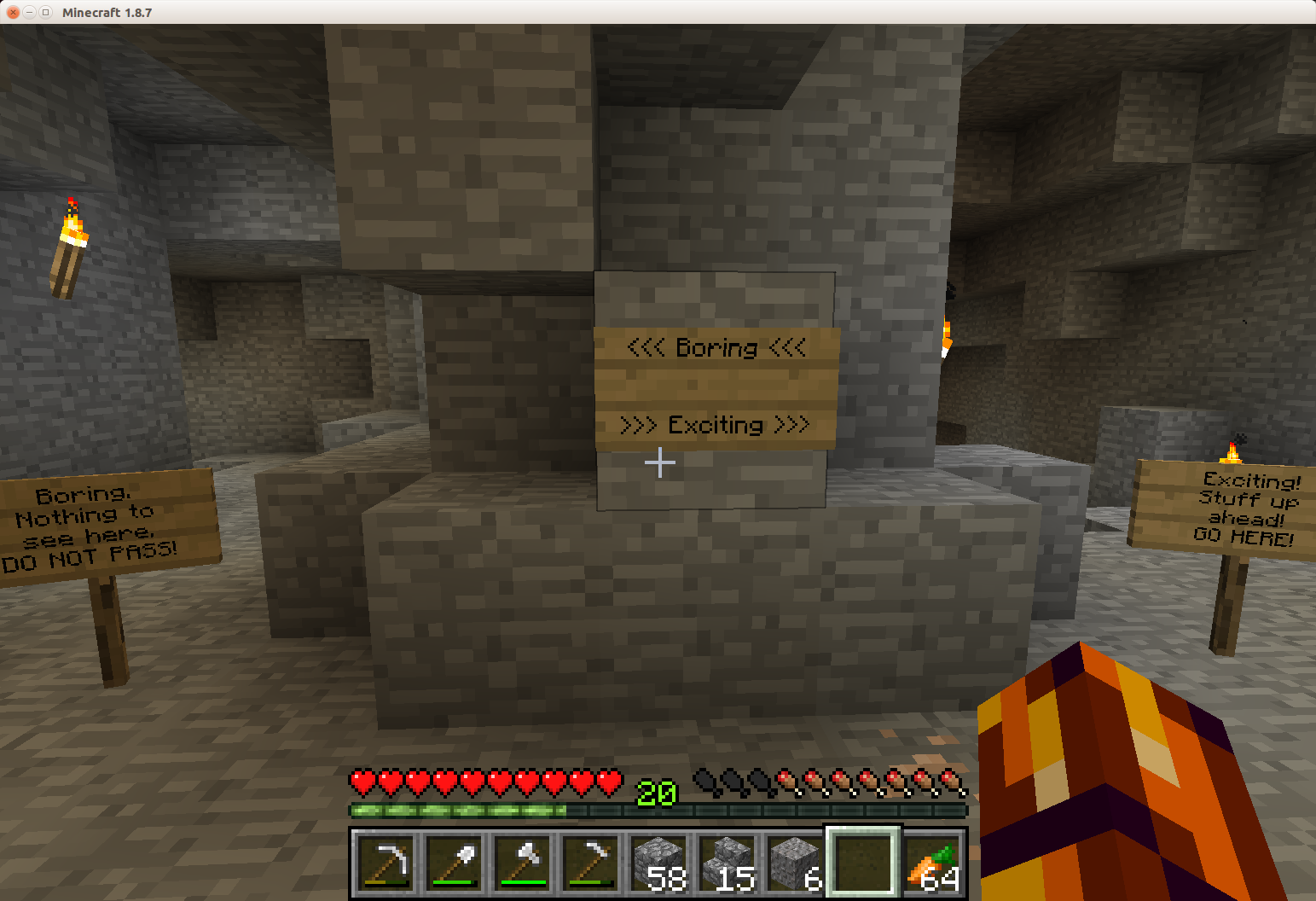
Now, more importantly, imagine just one sign being there at a time. What will the player do when they first walk into the intersection? This question plagued me when I realized an old habit of mine was folly. I used to always mark the boring areas with signs, to save time for other players. But if a player has to walk up to a sign to read it (and then change direction) at every minor intersection, not as much time gets saved. So, it's generally better to place the sign labeling the way the player wants to go, or perhaps in the middle, if both options are likely.
There are exceptions, of course, and they are important for level design. For instance, what if the boring path is almost entirely blocked off, and then a solitary sign says "DO NOT ENTER". Sure, the curious player will totally go for it, but most players won't even need to get close to get the message, especially if it shows up in a cavern more than once. What if the interesting path is hard to see, like a tiny offshoot of an otherwise wide walkway? Then a sign in the middle of the path, pointing towards the offshoot, is more effective.
And there's more to think about, things which surely come up naturally in any Minecraft player's travels. To give a taste, what about the fact that a sign can only face one way? There are certainly times when deciding which way it should face is important, and that decision drastically affects how the player responds to it. In general, signs are very interesting in how they affect players, and a game designer could probably have fun just placing various ones in a cavern and observing how a player reacts to them. What does it mean to a player if a sign faces a wall? What kind of text could you put there to make the player feel angry, happy, or a little creeped out? This is one of those things that makes game designing an art all to its own.
Torches
For those unfamiliar with torches, all you need to know is that they can be placed either on the top or side of a block, same as with signs. We have a general rule on the server I play on to place torches on the wall only on the left when exploring underground. The idea is that anyone, in anyone else's explored area, can find a way out by taking a path that keeps torches on the right wall. There are definitely some edge cases for which this doesn't really work, but it usually works fine since enemy mobs spawn only when the top of a block is too dark, so all lighting needs can be fulfilled by torches on top, making the wall torches "special".
The short story is that this works really well, for those aware of the convention. Think of it this way: While exploring, you already need to place lighting, so why not choose the placement in a way to convey information? Further, being able to return to the start easily without placing a single sign is a nice feature, especially since exploring an area with a sign system inevitably runs into the problem of "Why can't I find that one sign...".
Getting back to level design, we run into something interesting here. The torch system's greatest benefit is conveying information ("Which way is out?") at every position in a cavern. Ideally, wherever a player is, so long as a they're looking down a pathway, a wall-torch should be visible and prominent to indicate whether the pathway goes deeper or not. The best way to study this is to dive right into a cavern, light it up, tell another player of the convention, and watch them explore it, but I'll try to convey how this brings up real level design concerns in the following contrasting images. Both follow the convention with the same torch placement, but which is easier to interpret?
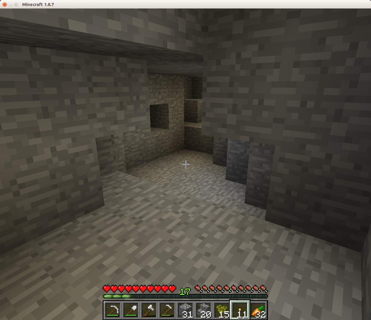
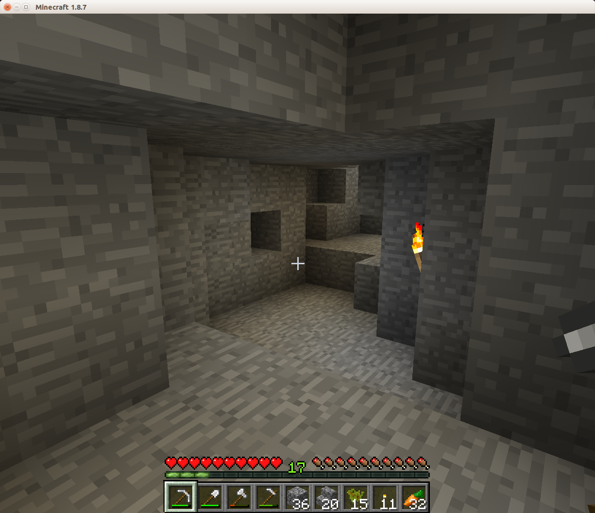
Yes, all I did was remove some blocks that were in the way. The thing is, what isn't conveyed in that image is that if I didn't remove those blocks, the only way to torch the place well would be ridiculous, with two or more extra torches.[1] In particular, this is only one vantage point; to fix the view from the opposite side, I removed more stone on that side of the torch, blocks which are visible in the picture, but not a problem from that angle. So you need to walk around as a player to get a feel for how to alter the place as a designer.
Really, though, you have to try it. I suggest going into a cavern, lighting it following the convention, but using only enough torches to prevent mobs from spawning, which is making sure every block is at most 6 blocks away from a torch. Then walk around in it, altering the level or adding torches only when absolutely necessary, and leaving a few spots deliberately confusing as a control. Watch another player navigate through it, and ask them what was frustrating. Maybe even turn the tables, and have a friend light up a cavern for you, then try to navigate it yourself.
Stairs
Anyone who knows my Minecraft style is completely unsurprised for this heading. Stairs are by far my favorite block, and I've found enough uses for them to warrant always keeping a half stack on hand, especially when dungeon crawling. After exploring with my brother, getting lost, and running out of signs, I improvised a third favorite dungeon crawling use for stairs. But I'll cover the two uses I already had first.
1) Marking the main path.
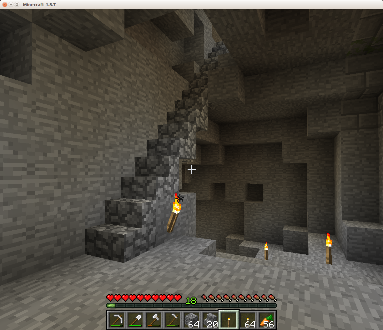
I like to make sure the path a player finds most prominent is the one they are most likely to want to take. Stairs are unusual-looking in a smooth, solid block cave, so every main entrance or exit is getting stairs when I'm around. Note that although the torch system mentioned before leads you home, it doesn't convey that you've made it back when the cavern is more prominent than the entrance. (All that happens is the torches change side, and the player goes, "Wait, what just happened?") Sure, as mentioned before, a clear sign in the middle would be enough, but the ability to alter the area in a way that encourages a player to look to what they want as oppose to presenting text is an important skill.
Stairs can do more than mark the entrance, though. Deeper inside the cavern, when there are forks where one path is more interesting than the other, stairs encourage players to take the better path without using any text. And it doesn't guarantee it to be the path the player wants, either, so it won't feel "misplaced" to them. It really is quite interesting how a thing so simple as a cobblestone stair can affect players. It's enjoyable to watch, too.
For more game-designing fun, think about prominence in a more general way. There are tons of ways to make a path stand out in Minecraft, or any game, so be creative. Instead of making one path look more exciting, what about making the other path look more dull? What if one path has a different aesthetic, is that always more prominent? Is there such a thing as "too prominent"? (There is certainly a "too much prominence". Keep in mind that the purpose is to control what the first thing the player notices is. If everything is prominent, then too much is competing to be the "first thing".)
2) Blocking fluid.
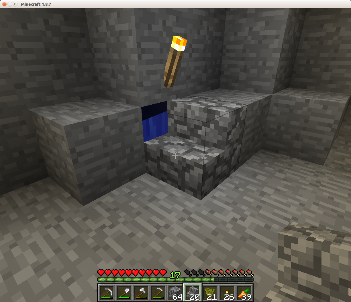
This use is really clear and simple. Blocking a water or lava flow with a stair keeps the path clear, but doesn't sacrifice the source block. Plus, you can still see what source block is behind it, so other players aren't likely to accidentally puncture the barrier. I particularly like to use this when first exploring a world, so that after I clear out enough of the area, I can build around the water to make farms, or pick up the lava blocks with a bucket to make a nether portal without a diamond pick.
There's not much to say about this and level design, since it is pretty much always clear. Perhaps, try to think of the edge cases where it's actually not effective, maybe by risking a player walking by and breaking the barrier. It's... possible.
3) Blocking a dead end.
And now, my final innovation that I am so very proud of.
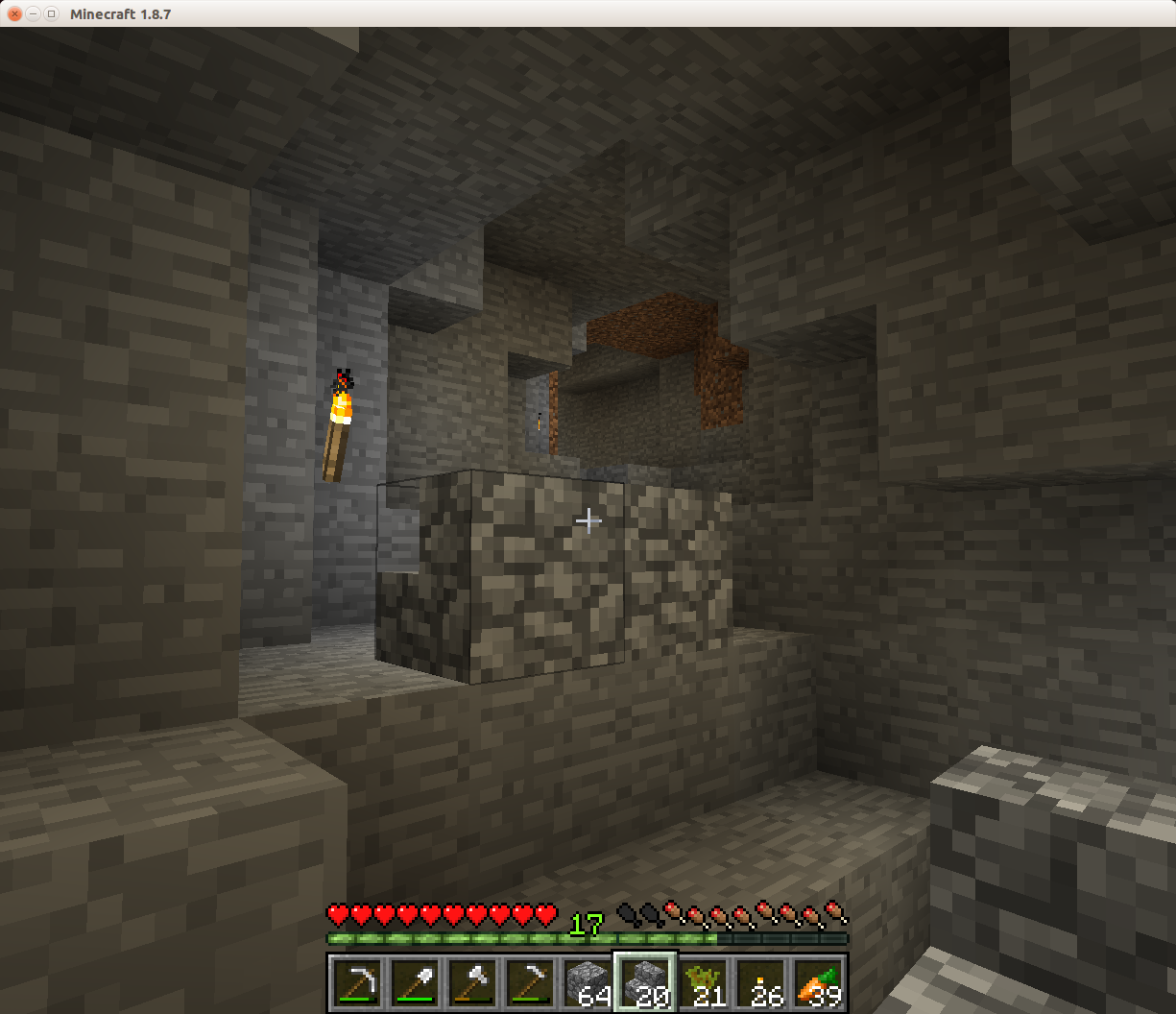
One thing I've noticed from all my stair usage so far is that when a stair is used in a non-functional way, (Where is that even going?) it makes the player reconsider what it's doing. Here, in particular, I also exploit that a stair on flat ground is easy to move across in one direction only, so placing it in the middle of a walkway conveys: There is only one way you want to move through here, anyway. Since it's not over-the-top, it also only encourages the most completion-minded individuals to explore the path. I especially like the method because it's really fast on placement: You only know that the dead end is there after you've been down it, and on the way out you just place it and walk over it. Done.
Now that I've tooted my horn on all that, let's really talk about it. If you've kept up with me so far on all that level design so far, then options should come to mind. Consider them, and perhaps study them in-game, pretending to walk around them as a player. Try similar but different solutions, and compare their effectiveness. Study how the walkway and intersection design affects the placement of the stair block, and perhaps how you may want to alter that very intersection to make the placement of the stair block more clear.
After you've done all that, perhaps you noticed the following things, just to name a few.
-
The deliberate gap between the stair and the wall is surprisingly helpful, since otherwise, it just looks like cobblestone until the player jumps over it.
-
If the entrance to the dead end is ascending or flat, as in the picture, it works fine, but if it's descending, the stair appears functional, and seems to encourage the player to descend. Backfire! In most cases, though, you can quickly modify the area slightly to get some flat space to put the stair on.
-
If the entrance approaches the intersection diagonally, then the stair may be viewed from awkward angles from which it looks "beside" the path, instead of "blocking" it. Frequently, some cleverly placed or removed blocks in the entrance will make it appear to be more clearly blocked off by the stair. The example in the picture can give inspiration as to how.
Feel free to discuss other observations in the comments, and I hope that gives the interested readers enough material to go on. Have fun!
Footnotes
Honestly, to help with torch situations like this one, I've occasionally used a torch on the floor right next to a wall to indicate it's not the wall-torch side, but I can't count on that being clear for every player. ↩︎